Content guidance
These guidelines will help you create consistent, quality content on Library digital signage. For more information on University branding, visit the brand microsite.
Logo
- The University logo should be placed top left on signage, as described in the brand microsite logo page.
- For standard 1920x1080 resolution signs, the logo should be 240px wide.
Text content
- Try to adhere closely to the 3x5 rule for text on a digital sign. This means keeping your text to three lines of five words, or five lines of three words.
- Size of font should be dictated by visual hierarchy, but for 1920x1080 resolution signage, 120pt is a good starting guide for the 3x5 rule.
- Use normal sentence case, never use all capitals.
- Unless two sentences appear next to each other, do not end sentences with full stops on digital signage. Treat text as you would subheadings.
Further information can be found on the brand microsite written word pages.
Social media promotion
- Social media account promotion should be included on signage where the viewer will find more information about that specific topic on our channels.
- Using photography in your signage can help to create visual impact. Make sure the image used is appropriate resolution for the size of the sign, and not cutting off or stretching part of the image to make it fit the sign.
- When selecting an image choose something that will have space to include your text on it, such as sky or a blank wall in the background (see contrast below).
Photography-based content
Further information on selecting photography can be found on the brand microsite photography pages.
Call to action and URLs
- If a call to action is appropriate for your sign, make sure it is short and simple.
- Do not use a URL as a call to action. Please cite a call to action followed by the URL
- Where linking with items on the Library website hero banner use “visit the Library website” or “find out more on the Library website”, otherwise use “search [blank] on the Library website”
Contrast
Text should be placed on as flat a background as possible with a high level of contrast between the text colour and the background it sits on.
Avoid applying stroke to text. If you’re struggling to make the text appear legible find a different placement for the text or choose a different background image.
Hierarchy
Make sure that the most important information in the sign is given priority in the visual hierarchy over the rest of the design elements.
Signage templates
Where there is no brand or visual identity for the item being promoted, use a templated background.
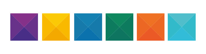
- Purple: generic Library services eg: book returns
- Yellow: wellbeing eg: Library Neighbours
- Blue: service disruption eg: power outages
- Green: survey and feedback eg: “You said, we did”
- Orange: exams eg: Exam Extra
- Turquoise: currently unassigned
These templates are available on the S: Drive as .ai swatches. Contact Kristian Scott to provide them in the format required.