Typography
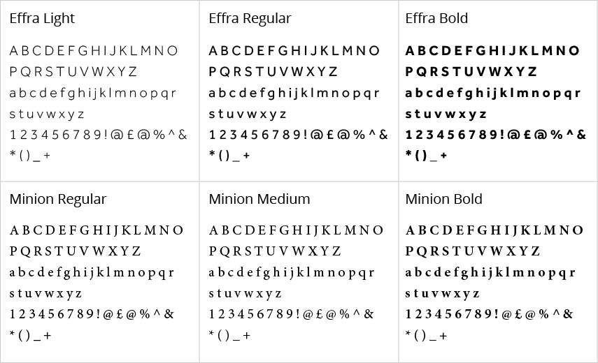
Consistent use of typography produces clear structure and hierarchy. While there are no absolute rules, it’s helpful to think about which of our fonts will work best within your design.
We recommend the use of the following fonts:
| Media/channel | Font | |
|---|---|---|
| Effra and Minion |
Request installation to IT | |
| Web and film | Open Sans | Self-install |
| Presentations and stationery | Open Sans and Arial |
Effra and Minion should be used in print. Effra is a sans-serif font that offers a rounded, practical and contemporary feel for both headings and body copy; serif font Minion offers classy, yet uncomplicated, characters in both upper and lower case.

Installing Effra and Minion
We have limited licences for Effra and Minion. Please note these two fonts are only to be installed on your machine if you work on the design of printed materials. They are not for Word files, PowerPoint presentations or web design.
To request the fonts please contact the IT Support Centre.
Web, film and presentations
Sans-serif fonts are standard on the web and digital channels because texts are harder to read on a computer screen. Open Sans is a round and clean font that reads well on screen so we recommended its use on websites, in film and in PowerPoint presentations. This text is written using Open Sans.
|
Open Sans Light A B C D E F G H I J K L M N O P Q R S T U V W X Y Z |
Open Sans Light Italic A B C D E F G H I J K L M N O P Q R S T U V W X Y Z |
Open Sans Regular A B C D E F G H I J K L M N O P Q R S T U V W X Y Z |
|
Open Sans Regular Italic A B C D E F G H I J K L M N O P Q R S T U V W X Y Z |
Open Sans Bold A B C D E F G H I J K L M N O P Q R S T U V W X Y Z |
Open Sans Bold Italic A B C D E F G H I J K L M N O P Q R S T U V W X Y Z |
Installing Open Sans
If a website is using one of the standard University templates, there is no need to install or download Open Sans; the font will be incorporated into the templates. If not using standard templates, do the following:
- Add this line of code to the website's header (which allows you to use the light, normal and bold versions of Open Sans):
<link href='https://fonts.googleapis.com/css?family=Open+Sans:400,300,600' rel='stylesheet' type='text/css'>
- Add the font name to your CSS styles:
* {font-family: 'Open Sans', sans-serif;} (this selects all elements)
For films and presentations, you can self-install the font on your computer.
Stationery
Letterheads in Word should be in Open Sans or Arial. Arial is available as standard on all PC and Mac computers. Printed stationery should be in the standard University font. For more information see our stationery guidelines.
